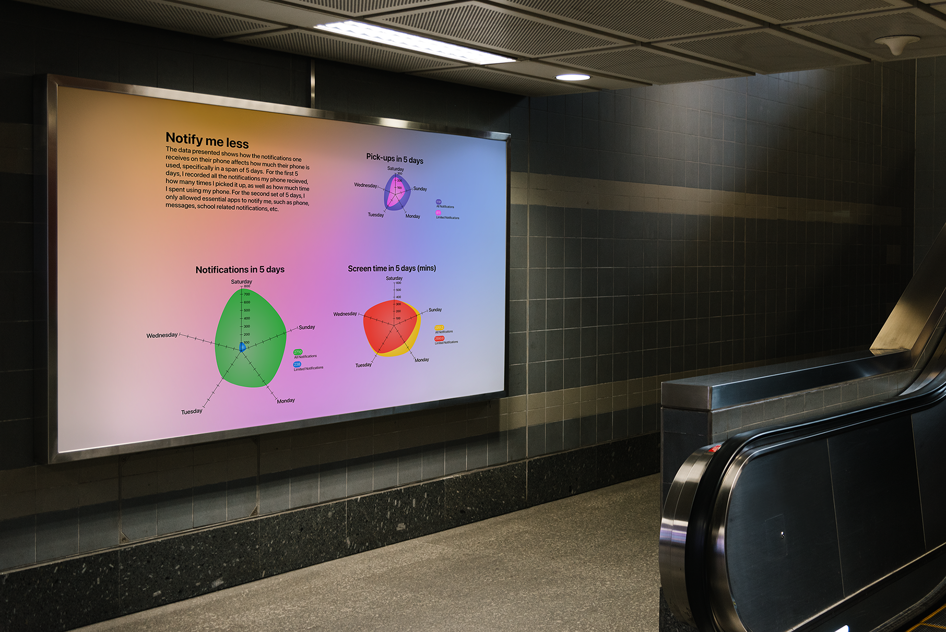
The primary objective of this project was to present data in a visually compelling format with a coherent narrative. Specifically, the focus was on examining the correlation between the frequency of daily notifications received and the corresponding increase in phone usage.
Throughout the project, my goal was to achieve a design that emulated the aesthetic of the IOS operating system. I meticulously incorporated the color palette consistently utilized within the IOS system, and utilized familiar assets commonly associated with the system, including the push notifications icon and gradient designs.
The data for this project was collected through a comprehensive analysis of my personal phone usage spanning a two-week period. During the initial week, I monitored and recorded the frequency of notifications received, the corresponding duration of phone usage, as well as the frequency of phone pickups.
In the second week, I limited the type of notifications allowed on my phone. Only essential notifications, including calls, text messages, and school-related alerts, were permitted.
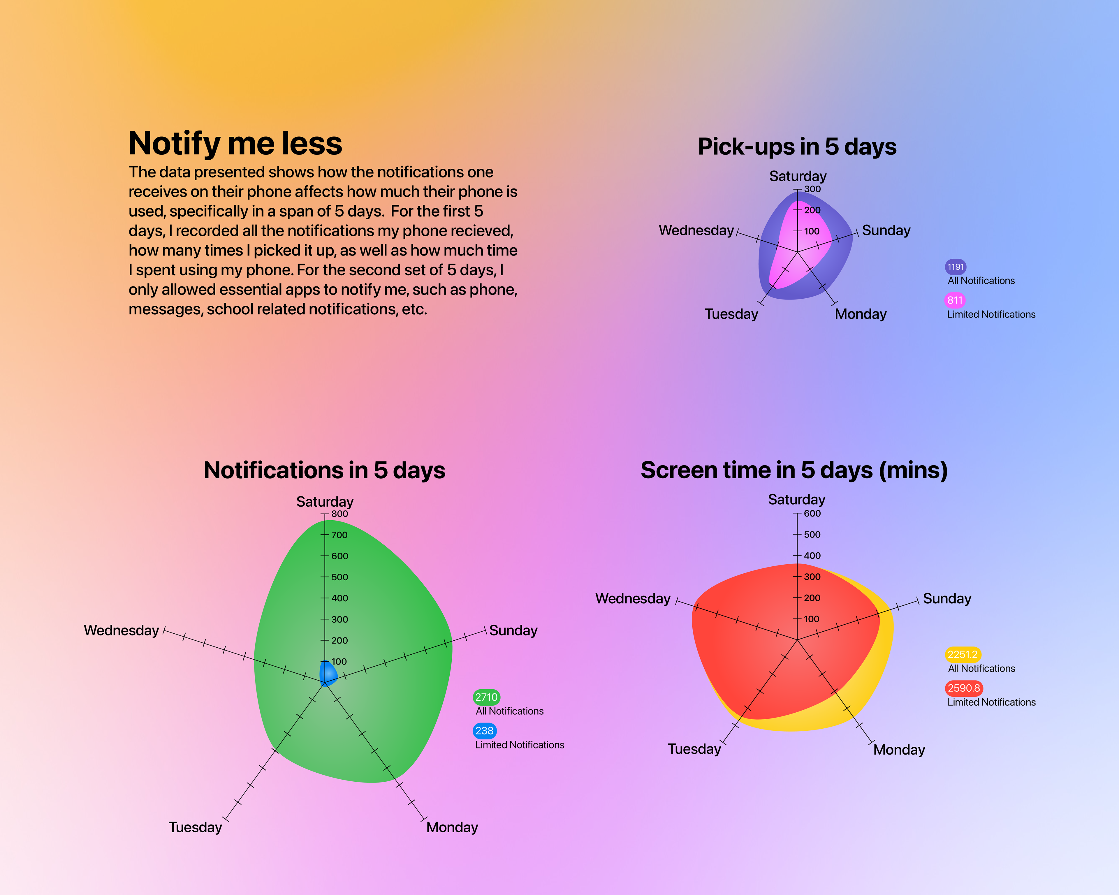
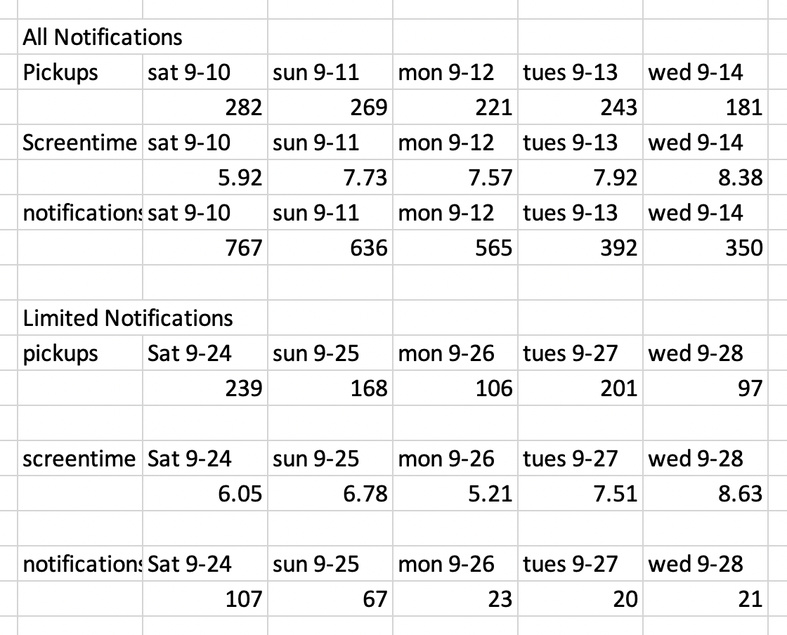
Presented is the raw data collected prior to visualization. The top section displays the data collected while receiving all notifications, whereas the bottom section reflects the data collected during the week where only essential notifications were permitted.